graphic design
Tourage Patisserie & Confections

Patisserie Brand
-
I was tasked with creating a logo for Tourage Patisserie & Confections, a luxury patisserie brand. The objective was to create a visual identity that captured the joy of eating pastries and the logo needed to be timeless and versatile for digital, print and packaging applications.
-
I approached the design with inspirations from Moorish architecture, art deco, and geometric patterns to create something simple and elegant. Other luxury brands were referenced to inspire the look and helped envision the end result.
-
The client was pleased with the final logo because it reflected their brand and was versatile for use on social media, signage, and the packaging. The logo made the patisserie’s brand stand out.
MELLOW
A magazine aiming to showcase independent artists
-
I entered a statewide competition where I collaborated with a team to develop a fully realized entrepreneurial venture, crafting a profit-driven business plan that encompassed every aspect of building a real-world business — from product development to monetization strategies.
-
We developed MELLOW, a magazine that features independent artists, during my senior year of high school. Artists such as musicians, visual artists, and fashion designers are highlighted to give them a platform to share their work and for sponsors to advertise products relative to the creative industry. My role was the lead designer. My main goal was to gather every artist’s vision and compile them into a cohesive design. From the photoshoots that involve settings that show their artistic approach (an indie rock band in a parking lot with graffiti) to editing the photos, I worked closely with the artists to help understand them more.
-
The final prototype magazine showcased diverse talent. The business model we created won a gold award at a state competition against 30 competing schools due to its originality and quality.


Promotional Marketing


Nevada Sage Group
-
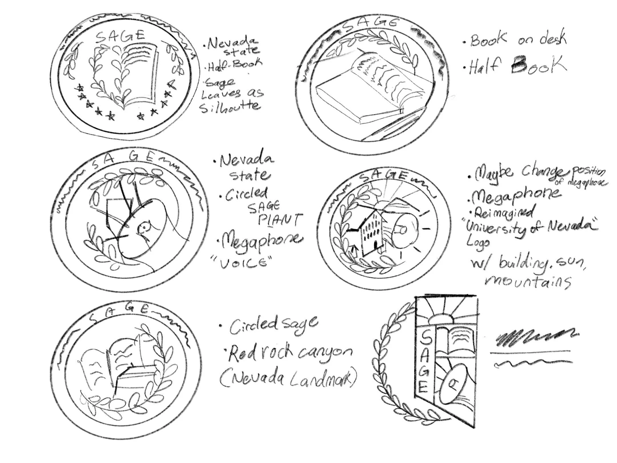
The Nevada Sage Group, a group that focuses on reimagining learning systems, wanted to update their visual brand. I aimed to reflect innovation and creativity in this design.
-
The branding kit included two custom logos, a color palette, typography, and more. I wanted to show strength and trust in the brand, so I chose a circle logo for the primary. I included sage leaves correspondent to the group’s name and the state of Nevada, displaying its uniqueness.
-
This branding kit provides strong and credibility. It made it easier for people to associate and learn more about the group’s mission for educational change.


Girls in Tech


logo for school event
-
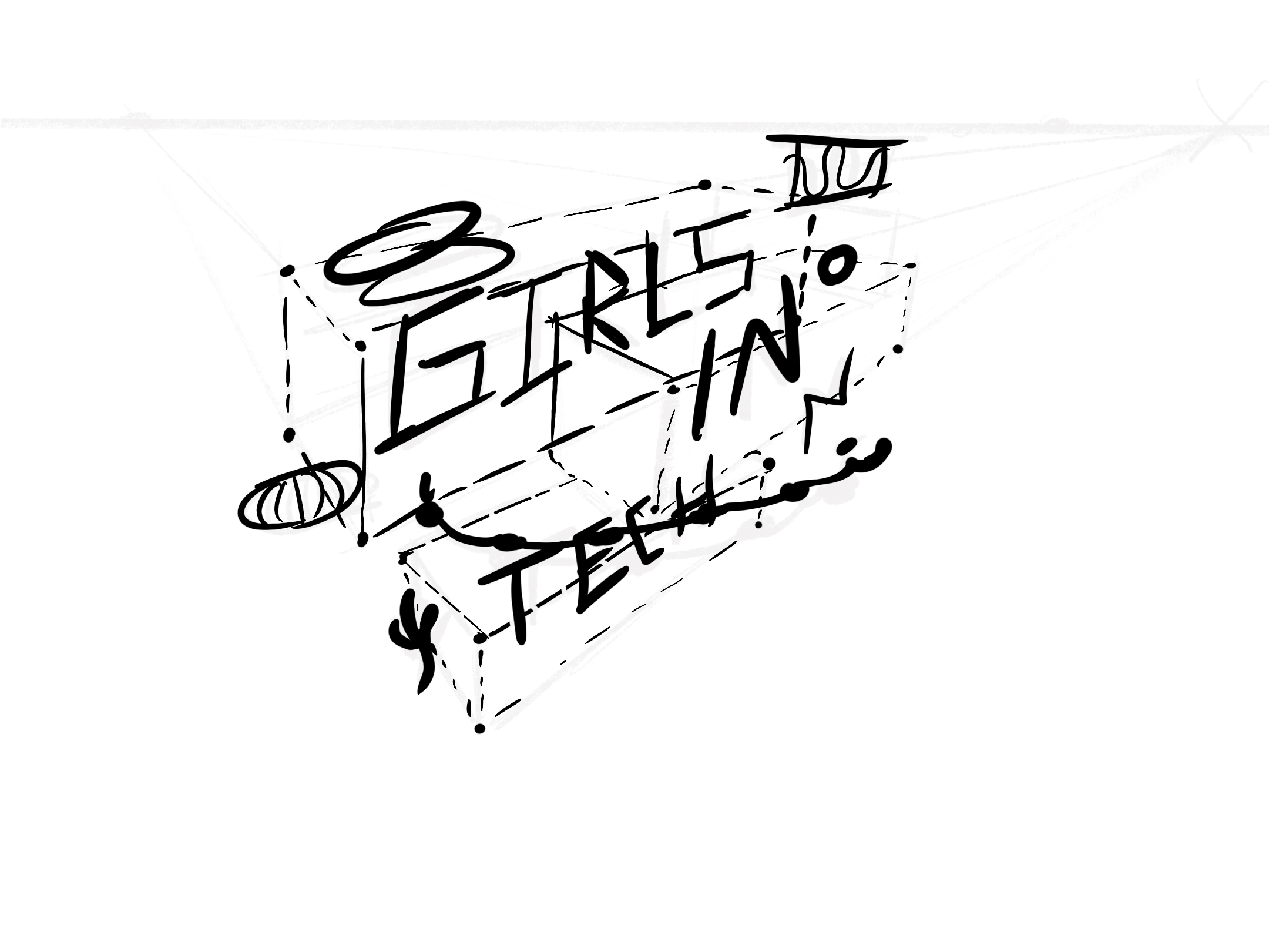
My school hosted an annual event, encouraging middle school girls to explore careers in technology. The goal was to create engaging and inspiring logo designs that evoked curiosity in young girls and adults.
-
The direction centered around a dynamic perspective, to show the energetic nature of technology. Deliverables such as digital graphics, name tags, and presentation slides had to be consistent. I used inspiration from the 2024 Paris Olympics for the color palette, showing off a laid-back yet fun mood.
-
This visual identity helped connect multiple different technology careers into one cohesive visual brand. It resonated with the target group and enhanced the atmosphere of the event.
miscellaneous graphic design work
-
Each client had a different specific goal though the overlaying need was for engaging content that aligned with each brand’s identity.
-
I started each project by delving deep into the brand’s target audience and visual guidelines. I designed with formatting requirements, ensuring brand consistency, and accessibility. I experimented with design elements to feature benefits and engage audiences.
-
The variety of work showed adaptability across platforms and client needs.
